
Judging a book by its cover is not so right, but let’s be honest: we all do this. A good cover can draw in more readers and give your novel a nice popularity boost. So, how do you make yours an instant hit? Let’s find out in this article!
1. Make It All About Your Book
Let’s be Captain Obvious: your cover should be about your book. We know it’s tempting to just throw in a picture of a hot guy you’ve googled up. Click-baiting does work, but do you really want to mislead your future fans? Try to pick the images that actually represent your characters and plot. It’s the best strategy that will pay off, unlike the random click-baity pictures.
Another good idea is to make sure that your cover reflects the book genre. Writing about a CEO billionaire’s romance? Make sure the man on the cover looks like one. A werewolf novel? Use some images of wolves, and you’re all fine.
The next tip is to give your readers a sneak peek into the book content. No spoilers, of course, but you can always add some hints at what’s to come. Even if your characters don’t get together in the second chapter, don’t be afraid to show them hugging or kissing (or both).
2. Stand Out from the Crowd
There are hundreds of good covers around, so it’s always nice to be unique. Instead of a copy-paste solution, take time and think out: a) your character representations; b) the composition; and c) the title font. These are the key elements of your future sweeping success.
We’ve already talked about the characters, so let’s skip a) and focus on the composition. There are actually dozens and dozens of tips on how to do it right. If you’re new to this, your best bet will be to google them up (we suggest starting with the “rule of thirds”). In a few words, your composition should be of the right size, symmetrical, and not contain distracting details. The most common mistake here is making characters or objects too big or too small for the frame.
Now, let’s be straight about the title font: Arial or Comic Sans are not good. Your font must be unique to stand out – and, ideally, reflect your book genre and style. No army fonts for a romance novel, or horror blood drips for a friendship tale (unless you’re writing the next Stranger Things). Also, make sure that your cover has the correct book title and your pen name.
3. Quality Does Matter
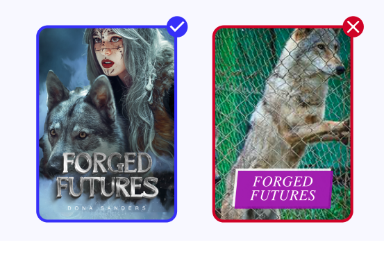
Your book may be the next best thing on this platform. But if your cover is poorly made, too blurry, or too small, this may be a bad signal to the reader. Think of it as a business card you’re giving to potential partners. Would you want it to be neat and professional – or clumsy and confusing?
Make double sure that the cover image is not blurry or pixelated in full size. It’s not the 1990s, right? High resolution images show that you love and care about your readers. They also look stunning on your book, so make sure you’ve got one.
Next, pick the right color scheme and double check if anything sticks out. Is your cover too light or too dark? Does it have enough contrast to catch the reader’s eye among the other books? The colors you choose must evoke the right emotions – and be palatable to the viewer.
Got it all? Amazing! Our very final tip is not to make your cover overly spicy, even if that’s what you’re writing. The R-rated content is more than welcome at AlphaNovel, but it’s better to leave it for the book text, not the cover. Let’s show respect to the readers that come to us for different types of books.
Now, go and make your novel cover a real champ!